Checkout | Buscapé
Checkout | Buscapé
Project
Project
Project
Buscapé, more than just a price comparison tool
Buscapé, more than just a price comparison tool
Buscapé is a reference price comparison platform that has connected consumers to various stores for 25 years.
Despite its tradition, its internal marketplace environment suffered from high checkout abandonment rates, showed some inconsistencies in branding, and had a low level of awareness among users, causing distrust regarding the reliability of less known stores.
Buscapé is a leading price comparison platform that has been connecting consumers to various stores for 25 years.
Despite its tradition, its internal marketplace environment suffered from high abandonment rates at checkout, showed some brand inconsistencies, and had a low level of awareness among users, causing distrust regarding the reliability of lesser-known stores.
Objective
Objective
Objective
Optimize the checkout by simplifying steps with a fluid experience aligned with the brand; better contextualize reliability and selection of the stores, increase order concentration/share and profitability of the marketplace.
Optimize the checkout by simplifying steps with a fluid experience aligned with the brand; better contextualize reliability and selection of the stores, increase order concentration/share and profitability of the marketplace.
My role
My role
My role
During the project, I worked alongside two designers: one in the discovery phase and the other in the UI design, ensuring a cohesive approach in both stages.
During the project, I worked alongside two designers: one in the discovery phase and the other in the UI design, ensuring a cohesive approach in both stages.
+
Benchmarking
Benchmarking
+
Quantitative research
Quantitative research
+
Blueprint with stakeholders
Blueprint with stakeholders
+
Usability test
Usability test
+
Interface design and prototyping
Interface design and prototyping
+
Documentation
Documentation

Laryssa Bolele
Laryssa Bolele
Product Designer Pl.
Product Designer Pl.

Thiago Almeida
Thiago Almeida
Senior Product Designer
Senior Product Designer
Data
Data
Data
Initially, we observed a checkout with many steps, some repetitions, and a high abandonment rate throughout the shopping experience, as shown in the graph below*
*Due to project confidentiality, sensitive data will not be disclosed
Initially, we observed a checkout with many steps, some repetitions, and a large abandonment throughout the shopping experience, represented in the graph below*
*For project confidentiality, sensitive data will not be disclosed

Benchmarking • Comparative table
Benchmarking • Comparative table
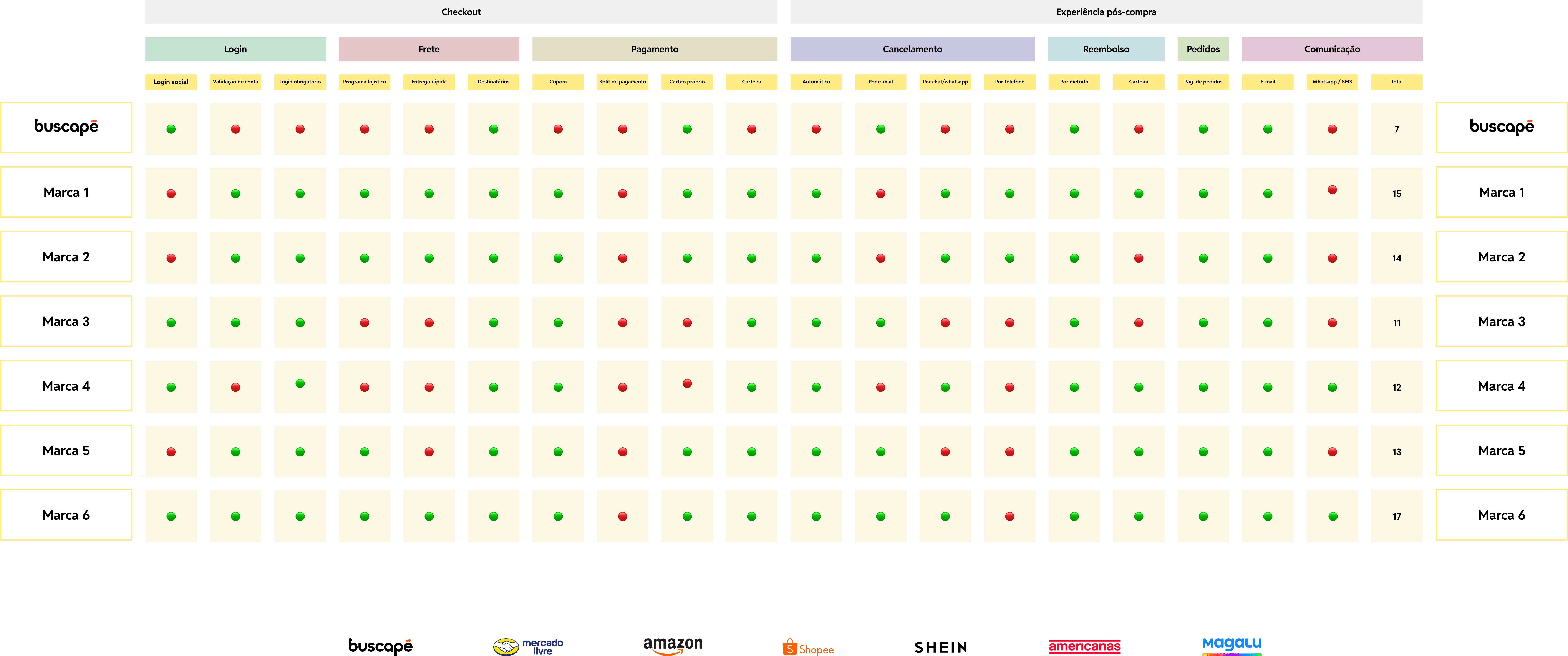
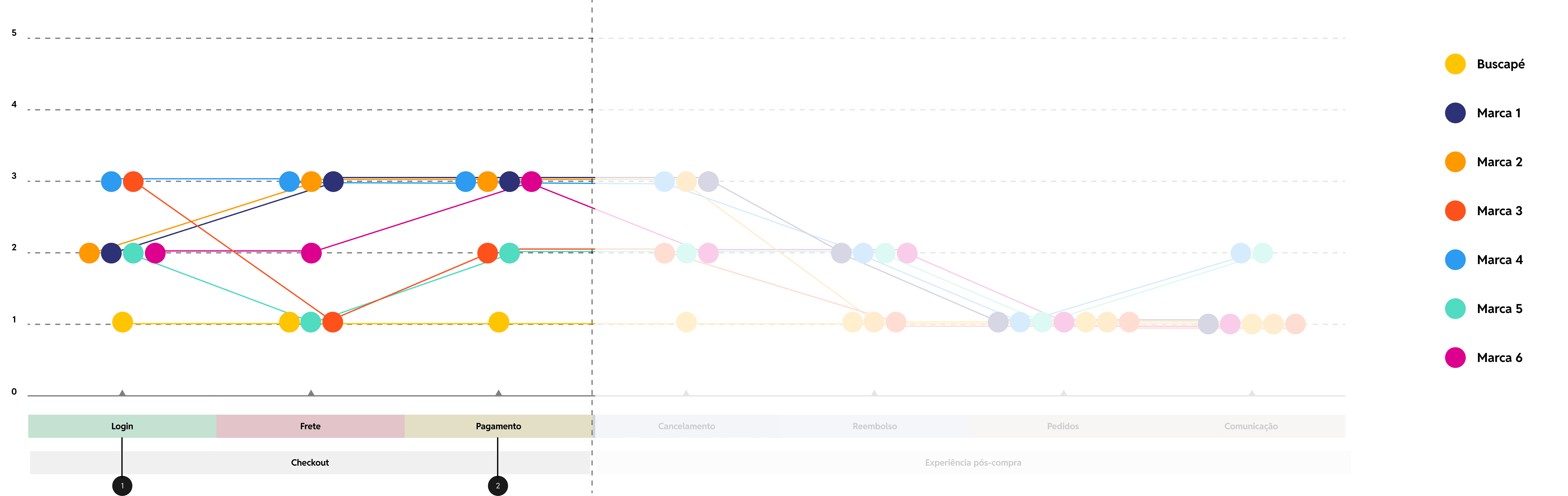
Featured opportunity
Featured opportunity
1
Mandatory login • Account creation
Mandatory login • Account creation
2
Coupon application • Diversification of payment methods
Coupon application • Diversification of payment methods
Benchmarking
Benchmarking
Usability test
Usability test
Usability test
Buscapé Marketplace
Marketplace
Buscapé Marketplace
Users were unaware of the Buscapé marketplace, but emphasized that the tool is facilitative, as it eliminates the need to create multiple accounts on different sites.
Users were unaware of the Buscapé marketplace, but emphasized that the tool is facilitative, as it eliminates the need to create multiple accounts on different sites.
Reliability
Reliability
Reliability
Users expressed skepticism when buying from lesser-known stores without reviews, wanting purchase guarantees like those offered by competitors.
Users expressed skepticism when buying from lesser-known stores without reviews, wanting purchase guarantees like those offered by competitors.
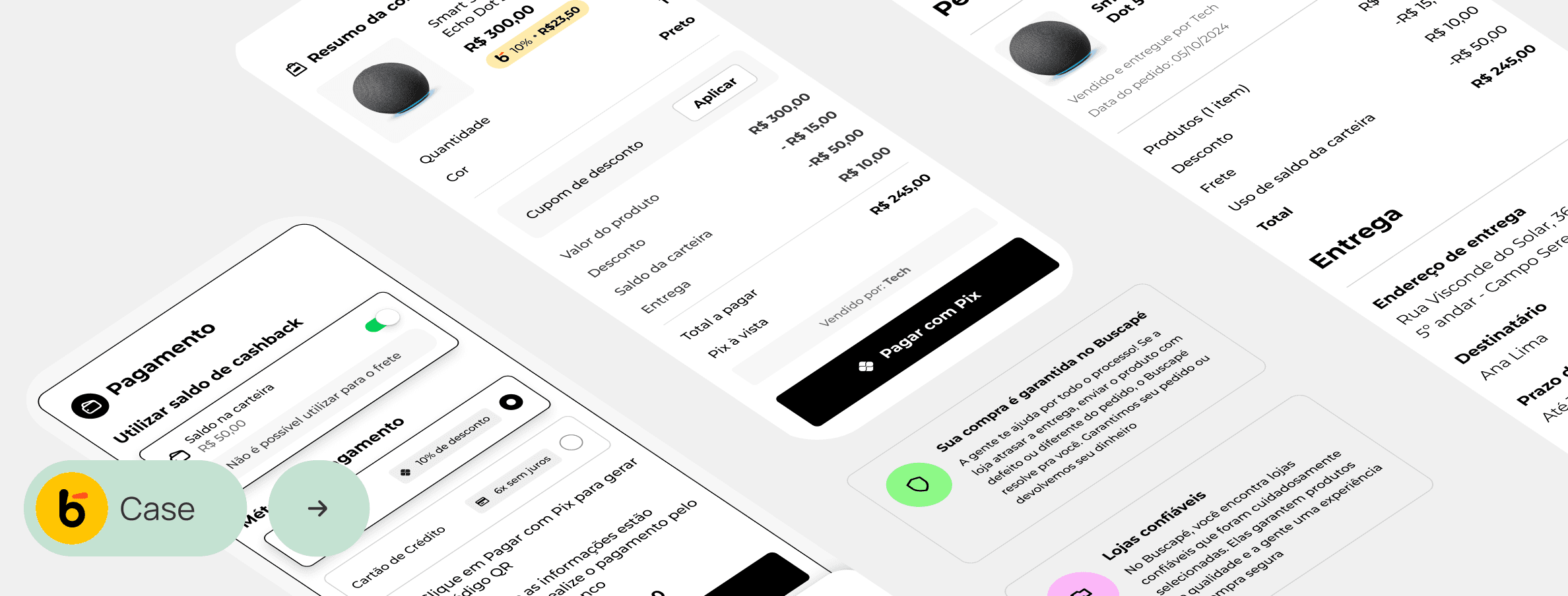
New checkout
New checkout
New checkout
1
Login: login required, removal of purchase as a guest
Login: login required, removal of purchase as a guest
2
Single page: the entire checkout is viewed on a single page, with reduced steps.
Single page: the entire checkout is viewed on a single page, with reduced steps.
3
Trust: explanatory texts about guarantees and store selection
Trust: explanatory texts about guarantees and store selection
Saved data:
If the user already has an account and address registration, they proceed directly to shipping
Purchase summary:
Throughout the journey, the user can access the purchase details in the summary modal
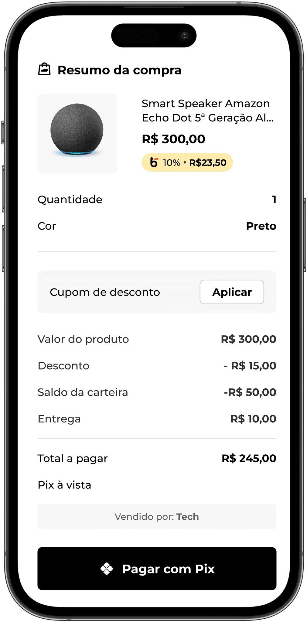
Purchase review:
Before finalization, the modal is opened for the user to check the values and confirm
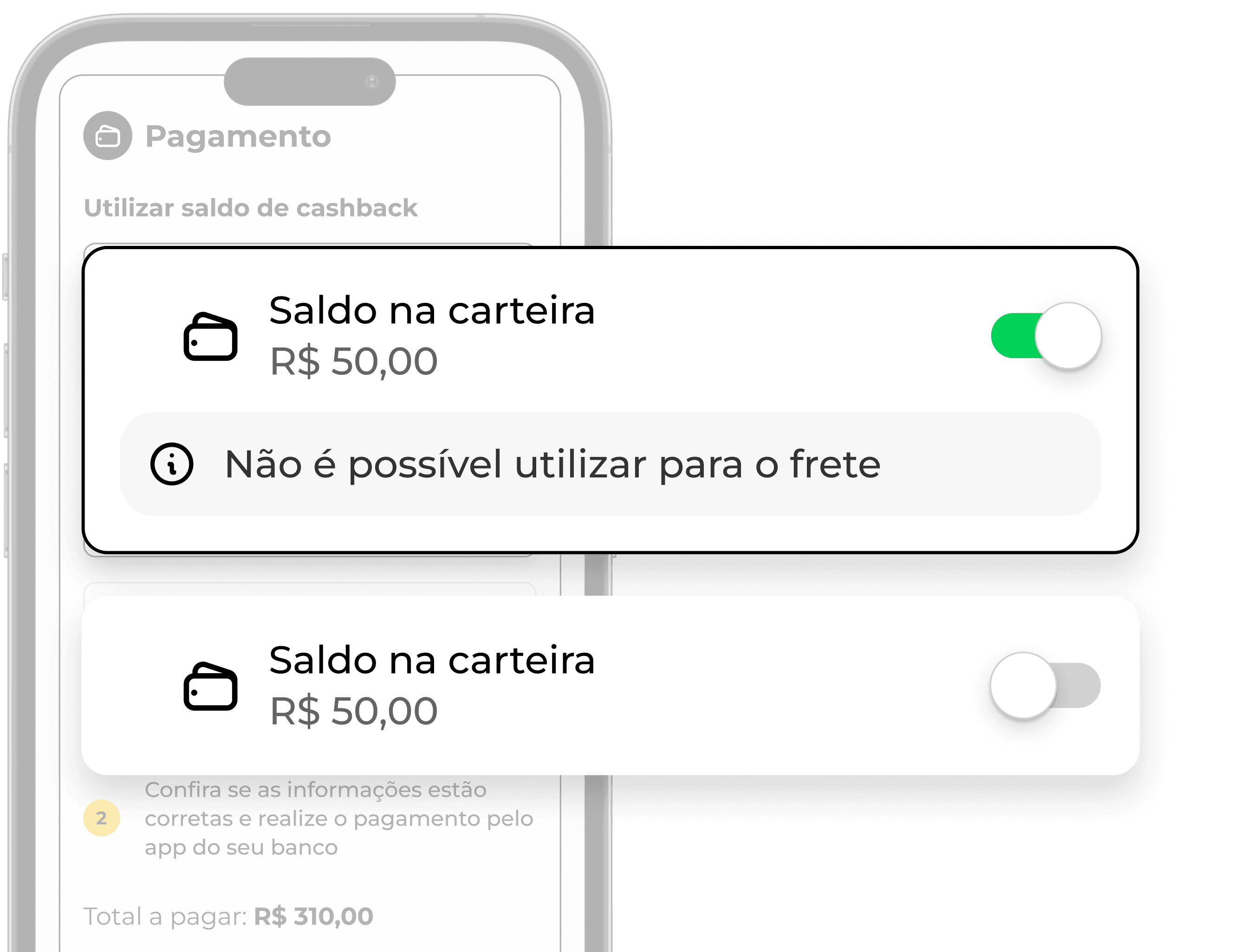
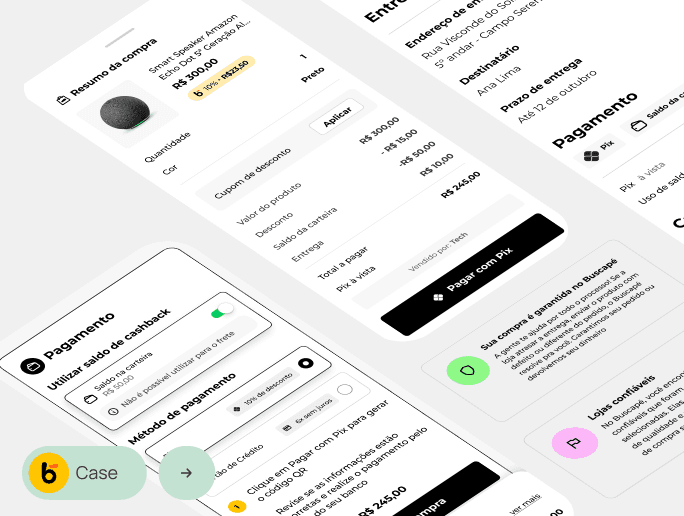
Cashback balance usage
Cashback balance usage
Including the use of cashback balance for purchases in the Buscapé app
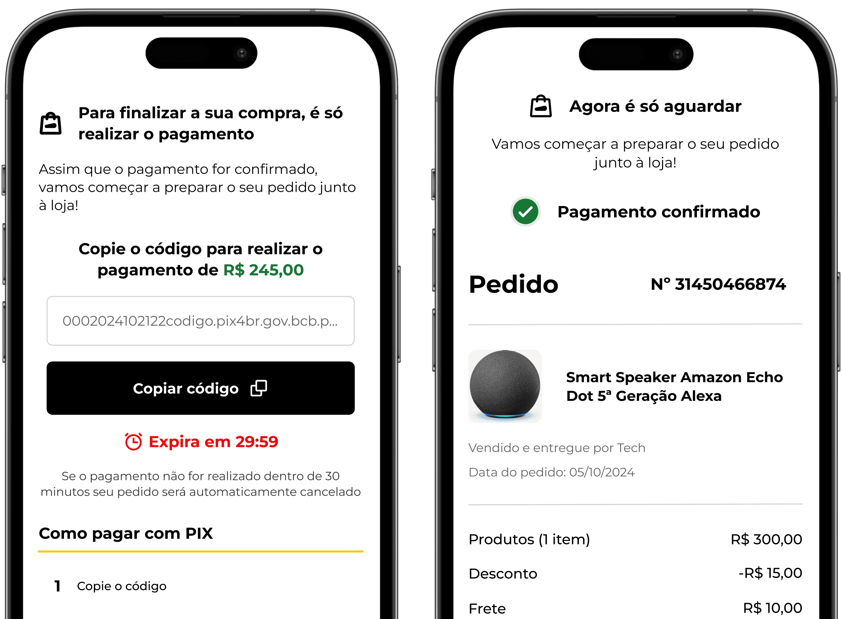
Pix Feedback
Pix Feedback
Payment via Pix now has a feedback screen when the transaction is confirmed; previously, communication was done exclusively through email.
Cashback balance usage
Cashback balance usage
Inclusion of using cashback balance for purchases in the Buscapé app
Pix Feedback
Pix Feedback